Android 的 UI 开发一般采用 XML 代码编写
控件
TextView
TextView 是最常用的控件之一,用于显示文本内容。它是 Android 提供的基础文本控件,可以显示单行或多行文本,并支持多种样式和事件。
基本属性
| 属性 |
说明 |
| layout_width |
设置控件的宽度,常用的有”wrap_content”(根据控件内容适配)、”match_parent”(与父容器同宽),以及确切数字,如 200 dp |
| layout_height |
设置控件的高度。 |
| id |
格式为”@+id/xxx”用于在代码中获取该对象,只需通过 findViewById ( R.id.xxx ) 即可获取到该控件。 |
| text |
设置文字内容 |
| textColor |
设置文字颜色,格式可以为”#xxxxxxxx”,前两位代表颜色的透明度(00 透明,FF 不透明),后面代表 RGB |
| textStyle |
设置文字风格,如 normal(无效果),bold(加粗),italic(斜体) |
| textSize |
设置文字大小,单位 sp |
| background |
设置控件背景颜色,”#xxxxxxxx”的格式同 textColor 一样,也可以是图片背景 |
| gravity |
控制文本在 TextView 内部的对齐方式,如 center、left、right 等。 |
| autoLink |
当文字内容出现 URL,E-Mail,电话号码等,通过设置 autoLink 属性,可以使其成为链接,常用类别有 web、email、phone、map 等 |
| fontFamily |
设置字体,可以选择系统字体或自定义字体 |
其中 text、textColor、background 属性的内容在开发中并不直接在控件中写明,而是写在 res\values\目录下的 colors.xml、strings.xml 中,然后被控件调用
1
2
3
4
5
| //在strings.xml中声明:
<string name="a">hello_world</string>
//在控件中引用:
<TextView
android:text="@String/a"/>
|
Button 继承于 TextView,所以 TextView 上很多属性也可以应用到 Button 上
1
2
3
4
5
6
| <Button
android:id="@+id/button"
android:layout_width="match_parent"
android:layout_height="wrap_content"
android:text="Button"
android:textAllCaps="false" />
|
在 MainActivity 中为 Button 的点击事件通过匿名类注册监听器每当点击按钮时,就会执行监听器中的 onClick() 方法,我们只需要在这个方法中加入待处理的逻辑就行了。
1
2
3
4
5
6
7
8
9
10
11
12
13
14
| public class MainActivity extends AppCompatActivity {
@Override
protected void onCreate(Bundle savedInstanceState) {
super.onCreate(savedInstanceState);
setContentView(R.layout.activity_main);
Button button1=(Button)findViewById(R.id.button);
button1.setOnClickListener(new View.OnClickListener() {
@Override
public void onClick(View view) {
}
});
}
|
通过接口注册监听器
1
2
3
4
5
6
7
8
9
10
11
12
13
14
15
16
17
18
| public class MainActivity extends AppCompatActivity implements View.OnClickListener {
@Override
protected void onCreate(Bundle savedInstanceState) {
super.onCreate(savedInstanceState);
setContentView(R.layout.activity_main);
Button button1=(Button)findViewById(R.id.button);
button1.setOnClickListener(this);
}
@Override
public void onClick(View view) {
switch (view.getId()){
case R.id.button:
break;
default:
}
}
}
|
EditText
EditText 允许用户在控件里输入和编辑内容。
1
2
3
4
| <EditText
android:layout_width="match_parent"
android:layout_height="wrap_content"
android:id="@+id/edit_text"/>
|
Android 控件的使用规律,用法基本上很相似,给控件定义一个 id,再指定控件的高度和宽度,然后再适当加入一些控件特有的属性就差不多了。
基本属性
| 属性 |
说明 |
| hint |
提示信息 |
| textColorHint |
提示文字的颜色 |
| inputType |
输入类型,如日期、电话、邮件等 |
| drawableLeft, drawableRight 等 |
在输入框的指定位置添加图片 |
| drawablePadding |
设置图片和输入内容的间距 |
| paddingLeft, paddingRight 等 |
设置内容与边框的间距 |
| selectAllOnFocus |
获得焦点后全选组件内所有文本内容 |
| minLines, maxLines |
设置最小、最大的行数,当输入内容超过最大行数,文字会自动向上滚动 |
ImageView
图片一般存放在 drawable 开头的目录下
1
2
3
4
5
| <ImageView
android:layout_width="wrap_content"
android:layout_height="wrap_content"
android:id="@+id/image_view"
android:src="@drawable/image1"/>
|
| 属性 |
说明 |
| src |
设置图片资源 |
| scaleType |
设置图片缩放类型,如 fitStart, fitCenter, fitEnd(等比缩放,位置放置不同)等 |
| maxHeight |
最大高度 |
| maxWidth |
最大宽度 |
| adjustViewBounds |
调整 View 的界限 |
ProgressBar
用于在界面上显示一个进度条,表示我们的程序正在加载一些数据。
1
2
3
4
| <ProgressBar
android:layout_width="match_parent"
android:layout_height="wrap_content"
android:id="@+id/process_bar"/>
|
| 属性 |
说明 |
| checked |
默认是否勾选 |
| drawableXXX(Left, Right) |
文字与选择框的相对位置。需要与 button =”@null”一起使用。 |
| paddingXxx |
文字与选择框的距离 |
| button |
设置为@null 表示不使用默认的选择框 |
AlertDialog
对话框
1
2
3
4
5
6
7
8
9
10
11
12
13
14
15
16
17
| AlertDialog.Builder dialog=new AlertDialog.Builder(MainActivity.this);
dialog.setTitle("Dialog");
dialog.setMessage("Something important");
dialog.setCancelable(false);
dialog.setPositiveButton("OK", new DialogInterface.OnClickListener() {
@Override
public void onClick(DialogInterface dialogInterface, int i) {
}
});
dialog.setNegativeButton("Cancle", new DialogInterface.OnClickListener() {
@Override
public void onClick(DialogInterface dialogInterface, int i) {
}
});
dialog.show();
|
AlertDialog.Builder 的基本方法
| 方法 |
说明 |
| setIcon(int iconId) |
设置图标 |
| setTitle(Charsequence title) |
添加标题 |
| setMessage(CharSequence message) |
添加消息 |
| setView(View view) |
设置自定义布局 |
| setPositiveButton |
确定按钮 |
| setNegativeButton |
取消按钮 |
| setNeutralButton |
中间按钮 |
| create() |
创建对话框 |
| show() |
显示对话框 |
ProgressDialog
1
2
3
4
5
6
7
8
9
10
11
12
13
14
15
16
17
18
19
20
| @Override
public void onClick(View view) {
switch (view.getId()){
case R.id.button:
String inputText=editText.getText().toString();
Toast.makeText(this, inputText, Toast.LENGTH_SHORT).show();
imageView.setImageResource(R.drawable.image2);
int progress=progressBar.getProgress();
progress=progress+10;
progressBar.setProgress(progress);
ProgressDialog progressDialog=new ProgressDialog(MainActivity.this);
progressDialog.setTitle("This is ProgressDialog");
progressDialog.setMessage("Loading......");
progressDialog.setCancelable(true);
progressDialog.show();
break;
default:
}
}
|
布局
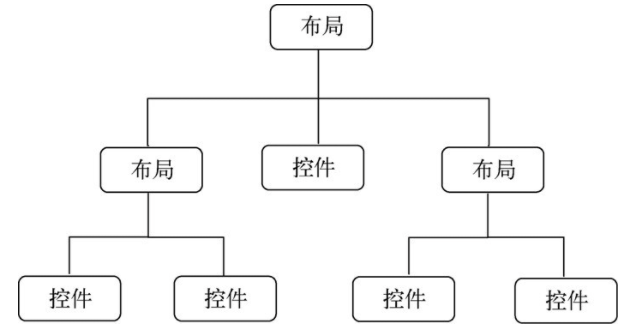
一个丰富的界面总是要由很多个控件组成的,那我们如何才能让各个控件都有条不紊地摆放在界面上,而不是乱糟糟的呢?这就需要借助布局来实现了。布局是一种可用于放置很多控件的容器,它可以按照一定的规律调整内部控件的位置,从而编写出精美的界面。当然,布局的内部除了放置控件外,也可以放置布局,通过多层布局的嵌套,我们就能够完成一些比较复杂的界面实现
LinearLayout
LinearLayout 称为线性布局,是一种比较常用的布局。这个布局会将它所包含的控件在线性方向上依次排列。线性排列肯定会分为垂直和水平,通过 android: orientation 控制,如果是垂直就是 vertical,如果是水平就是 horizontal。
| 属性 |
说明 |
| orientation |
布局中组件的排列方式,如 horizontal(水平摆放)、vertical(垂直拜访,即一个控件占一整行) |
| gravity |
控制组件或布局所包含的子元素的对齐方式,可以多个组合,以 | 分隔,如 bottom|left 表示位置在左下方 |
| layout_gravity |
控制当前组件在父容器的对齐方式 |
| background |
为当前组件设置背景(图片、颜色) |
| divider |
分割线。与 showDividers 搭配使用 |
| showDividers |
设置分割线所在的位置,如 none(无)、beginning(开始)、end(结束)、middle(每两个组件间) |
| dividerPadding |
设置分隔线与左右两边的间距 |
| layout_weight |
等比例划分剩余区域 |
1
2
3
4
5
6
7
8
9
10
11
12
13
14
15
16
17
18
19
20
21
22
| <LinearLayout xmlns:android="http://schemas.android.com/apk/res/android"
android:orientation="vertical"
android:layout_width="match_parent"
android:layout_height="match_parent">
<Button
android:layout_width="wrap_content"
android:layout_height="wrap_content"
android:id="@+id/button1"
android:text="Button 1"/>
<Button
android:layout_width="wrap_content"
android:layout_height="wrap_content"
android:id="@+id/button2"
android:text="Button 2"/>
<Button
android:layout_width="wrap_content"
android:layout_height="wrap_content"
android:id="@+id/button3"
android:text="Button 3"/>
</LinearLayout>
|
相对布局
RelativeLayout 又称作相对布局,比较随意,通过相对定位的方式让控件出现在布局的任何位置。
| 属性 |
说明 |
| gravity |
控制组件或布局所包含的子元素的对齐方式 |
| ignoreGravity |
设置为 true 将不受 gravity 属性的影响 |
| layout_alignParentXXXX(Left, Right 等) |
根据父容器定位。左(右)对齐 |
| layout_centerXXXX(Horizontal, Vertical, InParent) |
根据父容器定位。水平居中,垂直居中,中间位置 |
| layout_XXX(toLeftOf, toRightOf, above, below, alignTop, alignBottom, alignLeft, alignRight) |
根据兄弟组件定位。根据 id 来设置。其中 toLeftOf, toRightOf, above, below 是参考组件的左、右、上、下边,而 alignTop, alignBottom, alignLeft, alignRight 则是 对齐 参考组件的上、下、左、右边界。 |
| layout_XXX(margin, marginLeft, marginRight, marginTop, marginBottom) |
设置组件与父容器的边距(偏移) |
| padding, paddingXXX(Left, Right, Top, Bottom) |
设置组件内部元素间的边距 |
1
2
3
4
5
6
7
8
9
10
11
12
13
14
15
16
17
18
19
20
21
22
23
24
25
26
27
28
29
30
31
32
33
34
35
36
37
38
| <RelativeLayout xmlns:android="http://schemas.android.com/apk/res/android"
android:layout_width="match_parent"
android:layout_height="match_parent">
<Button
android:layout_width="wrap_content"
android:layout_height="wrap_content"
android:id="@+id/button1"
android:layout_alignParentLeft="true"
android:layout_alignParentTop="true"
android:text="button 1"/>
<Button
android:layout_width="wrap_content"
android:layout_height="wrap_content"
android:id="@+id/button2"
android:layout_alignParentRight="true"
android:layout_alignParentTop="true"
android:text="button 2"/>
<Button
android:layout_width="wrap_content"
android:layout_height="wrap_content"
android:id="@+id/button3"
android:layout_centerInParent="true"
android:text="button 3"/>
<Button
android:layout_width="wrap_content"
android:layout_height="wrap_content"
android:id="@+id/button4"
android:layout_alignParentLeft="true"
android:layout_alignParentBottom="true"
android:text="button 4"/>
<Button
android:layout_width="wrap_content"
android:layout_height="wrap_content"
android:id="@+id/button5"
android:layout_alignParentRight="true"
android:layout_alignParentBottom="true"
android:text="button 5"/>
</RelativeLayout>
|
帧布局
帧布局。从父容器左上角开始绘制,按组件或布局的定义顺序依次绘制,造成覆盖效果。
基本属性
| 属性 |
说明 |
| foreground |
设置前景图像 |
| foregroundGravity |
设置前景图像显示的位置 |

